37) Edit tutorial with Amanda and Lee - 23/4/18
- Apr 23, 2018
- 3 min read
On Monday we had another edit tutorial, this time Lee joined us as well, and I took both edits I'd made to show. My notes from the tutorial can be seen below.

So the first point they made was that they preferred the cleaner layout (edit 1), and that it needs more interiors and more portraits. Initially I only made the newspaper 16 pages, but we discussed how it should be longer so I can tell more of the story. Overall they just felt there wasn't enough images in there.
The second point they made was about this double page spread:

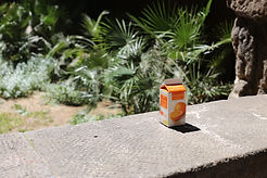
Both the tutors and everyone else in the edit tutorial just thought this image of the milk wasn't as strong as some of my others, and suggested I replace it with another. I found this quite hard to take because I really like this image, I just like how it's an environmental still life shot and shows how even the simplest tasks like keeping milk cold are affected by how they live.
Another point we discussed was this final page:

and the negative connotations that come with it. The first thing they said was the image of the rubbish doesn't really show how they're ordering and getting rid of their rubbish, instead it just looks in an unorganised pile. I agreed with this point, and didn't think of it in this way when initially adding it in. Secondly they didn't like the image of the street itself. Again, it brings negative connotations because it shows too much of the reality of it to the viewer. I still want to show these people in a good light, and this image doesn't focus on this, it just shows a picture of all these vans on a street. Lee also explained that this shot doesn't need to be in for context because they can already see the street in the background of other photos, and they know where it is because the title of the newspaper is "Greenbank". I think I really need to work on not getting too attached to images and just putting them in, but instead think about how it betters the story I'm trying to tell, and whether the image comes across negatively or positively to the viewer.
We also spoke about the quote I had inserted from the song 'Battle of the Beanfield', and how it's not needed because my introduction already explains everything the viewer needs to know.
Amanda and Lee also mentioned the point that the dog cannot be seen enough on the front cover, so I need to move the image to the right more. I agreed with this point and made a note of it to amend in my next edit.
They also mentioned that I didn't need any quotes or layering with this double page spread:

because it takes effect away from the newspaper excerpt itself. After looking back I can see this, and the other image and quote are just unnecessary. It gives the viewer too much to look at, when they should just be focusing on the largest image, which sets the scene for the rest of the publication.
Overall I took a lot away from the tutorial and found it really helpful on decisions for the layout itself. They brought up some really good points about the connotations of some of the images, how the sequence shouldn't look overcrowded but have a cleaner look, and that I need more interiors and portraits included. I'm going to take these comments on board and make another edit, which will hopefully be the one where all the elements come together successfully.


Comments